
HUMN Period Products
Branding + Packaging
THE CHALLENGEPeriod brands are very feminine and often not inclusive. My goal was to create a product that is inclusive, and uses neutral language and imagery.

Integrated Design
Strategies Class
PROJECTRECOGNITIONGold Addy Award
Cleveland, Ohio
As a student at Cleveland State University, our class was tasked with creating a new direct-to-consumer specialized online retailer. This included developing a visual identity and a basic group of communication elements to promote the product and brand.
We were to Identify a target audience and develop an integrated promotional campaign that reinforces the company’s brand position and introduces the new product.
OVERVIEWResearch
Branding
Packaging Design
Visual Design
ROLEDATESpring 2019
PHASE 01 :
THE RESEARCH
Conducting competitive research included taking a deep dive into potential competitors’ messaging, values, and overall identity. This allowed me to see gaps, potential pain points, and better position my brand within the industry.
COMPETITIVE RESEARCH
Understanding the audience is a key component of marketing. These personas demonstrate a clear picture of my target audience and help create meaningful interactions with products.
PERSONAS
PHASE 02 :
KEY MESSAGING
With a deeper understanding of the competitive landscape and my target audiences, I was able to develop core brand values and personality traits that I used as a jumping off point for the creative direction.
KEY MESSAGINGCORE BRAND VALUESEMPOWERMENT
INCLUSIVITY
COMMUNITY
QUALITY
DOWN-TO-EARTH
Everyone belongs in the HUMN family
because we stand for all.
PERSONALITY TRAITSDARING
We’re not afraid to be different and
embrace what makes us all unique.
RELIABLE
You can always rely on receiving the highest quality products each month.
SUPPORTIVE
We want you to feel confident and seen when using our products.
For good humans.
We give a damn.
For all.
Live free.
Join the revolution
KEY MESSAGES TAGLINEPeriod Goods, For Good Humans.
Welcome to
the revolution.
BRAND PROMISEWe’re committed to delivering quality products, that are inclusive to all; because we give a damn.
PHASE 03 :
BRAND IDENTITY
I was asked to create an identity for Drughelp.care that is approachable, understanding, and knowledgable.
BRAND IDENTITYThe main Humn logo lockup was designed to be bold, gender-neutral, and confident. The underlined “U” helps convey Humn as a brand focused on the individual.
The sans-serif fonts used were chosen for their geometric letterforms and slightly rounded finish, adding a bit of warmth.
LOGOCOLOR PALETTEThe minimal color palette is intended to stand out amongst other, more feminine brands, and to be more inclusive. Using minimal colors allows the messaging and other brand elements stand out.


PHASE 04 :
BRAND APPLICATION
This box was intentionally designed with the audience in mind. Fun, inclusive messaging is meant to make the user feel confident and seen.
TAMPON BOX

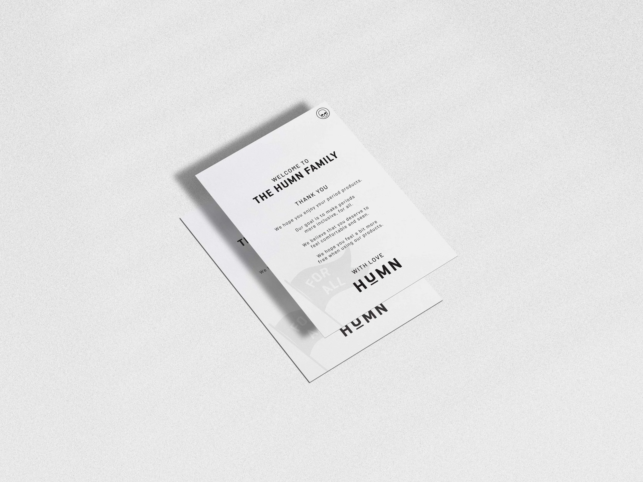
The following deliverable creates a unique unboxing experience. By creating multiple branded layers, the process of opening the box feels special.
PACKAGING SUITEPACKAGING SUITE DELIVERABLESCustom Mailing Box
Branded Packaging Tape
4x6 “Thank You” Insert
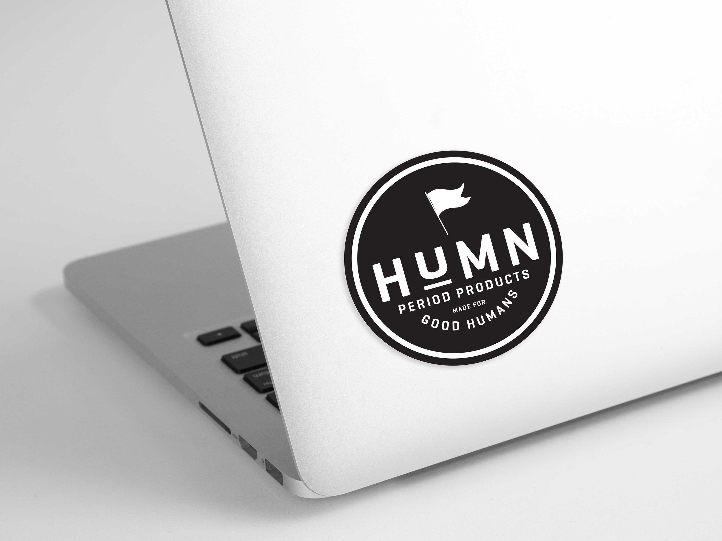
Merch: Pennant, Sticker


MORE PROJECTSHealthcare
UX Design + Brand Identity
2020
Jewelry
Brand Identity + Packaging
2022
Agriculture
Logo Concept
2021